A clear store introduction
The opening section explains the store’s offer and gives visitors a direct route to directions or product categories.

WEB DESIGN / LOCAL RETAIL
HALFPRICE · Oshawa, Ontario
A website introducing affordable groceries and everyday essentials, with product categories, store photography, and practical information for planning a visit.
[ THE WEBSITE ]
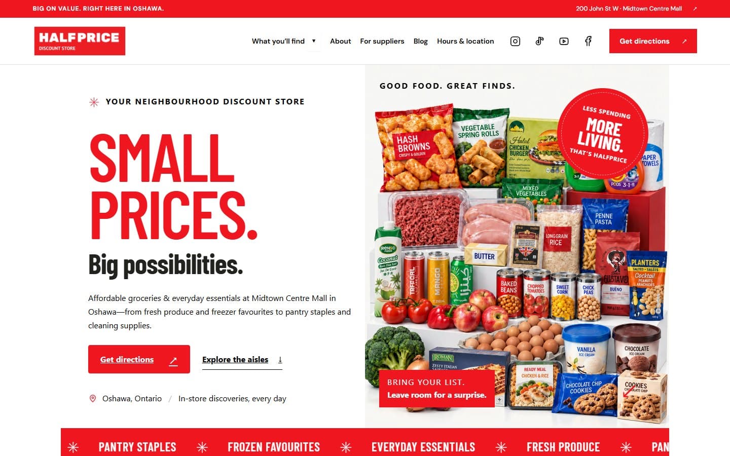
The HALFPRICE website introduces the store’s grocery and household range, then guides visitors through product categories, store information, and directions.
Bold red typography, product imagery, and conversational copy give the website a recognisable retail personality. Photos of the store and storefront connect the online presentation to its Oshawa location.
[ DESKTOP EXPERIENCE ]
[ DESIGN APPROACH ]
Red, white, and near-black create a direct visual identity. Condensed headlines highlight the main messages, while product photography and everyday language introduce the range available in store.

[ MOBILE EXPERIENCE ]
The mobile preview shows how shoppers can explore categories and find opening hours, contact details, and directions on a smaller screen.
[ INSIDE THE WEBSITE ]
The opening section explains the store’s offer and gives visitors a direct route to directions or product categories.
Expandable categories introduce fresh produce, meat, dairy, pantry staples, drinks, and home essentials.
Store and storefront photographs give visitors a preview of the physical location.
The address, opening hours, phone number, and directions are grouped together for easy reference.
[ YOUR NEXT WEBSITE ]
Tell me about your business, the website you need, and what visitors should be able to do.
Start a Website Project